Layout Settings
Summary
- Supports Bootstrap
- Bootstrap makes the tabs look like the rest of the site, if the website uses bootstrap
- Supports tab and accordion layout, optionally displayed inside popups
- Modules can also be turned into an inner accordion
- Layout can be adaptive to show accordion on mobile devices and tabs on the rest
- And of course, it’s responsive
No matter the options selected, from Accordion widget combined to other available options, like Auto Scroll or Collapsible settings, the layout of the created page will be consistent with your needs and pretty appealing to the eye.
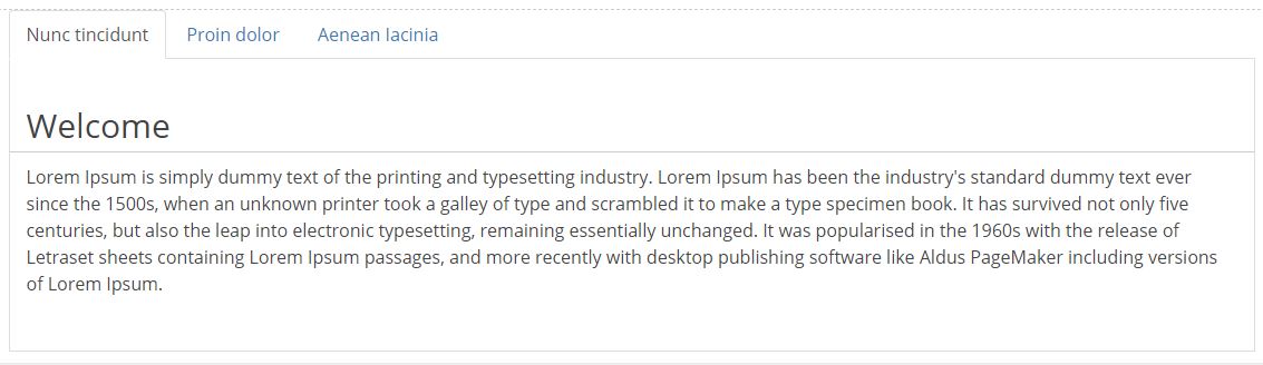
To be more specific on what our Tabs Pro module can look like when we apply these widget providers, you’ll find several image examples listed above.

Tabs Layout
In terms of tabs layout customization, the Tabs Pro module has 5 options which give us the possibility to place the tabs above, below, vertically to their content or in accordion. Click here to learn how these options work.
Full width tabs
This function is only available for horizontal tabs. When it’s enabled, tabs will split the available container space equally among themselves.
Tab minimum width
In pixels, set the min-width of a single tab globally.
TabsPro Container Class
This css class is added to the TabsPro’s container for custom bootstrap tabs styles provided by different skins.
Panel Height
Set to 0 or leave empty for auto.
Collapsible Panels
This Behavior option, as we call it, can be used for all the layouts described above and has the purpose to let the user close or open the active panel by a click or a hover action and it works for both tabs and accordion. Once checked, it comes with an “Initially collapsed” sub-option which when is enabled, no item will be active unless derived from persistence options.
Collapsible

Not Collapsed
Show Loading Animation
This function only works with Action Grid or Action Form.
Show Empty Tabs
When one of the tabs does not have any module selected to be displayed inside the tab or when the user does not have view rights to the modules enclosed in a tab, then when this “Show empty tabs” option is set, the empty tab will be displayed on the page - in edit as well as in non edit mode.
Open as modal
This option enables to open TabsPro as Modal. In case the Open as Modal option is enabled, there exists the possibility to append some HTML content with links that trigger the dialog to open. The trigger should looks like <a href="javascript: dnnsf.api.tabspro.openModal({mid:552});">Open TabsPro</a>. It can be triggered outside this module (for example in a HTML module or in the DNN Skin); leave the field below empty.
Close it by calling the next javascript method dnnsf.api.tabspro.closeModal({mid:552});