UI Settings
Summary:
- Bootstrap does not come with any themes, but usually integrates seamlessly with the website design, if the website was also built with Bootstrap
- Bootstrap template is also a web standard, so it’s easily customizable via CSS
We’ve completely rewritten Tabs Pro version 2.0 to be based on Boostrap 3 instead of jQuery UI. jQuery UI is still supported and it still supports jQuery UI Theme. This means you can either use existing themes in the Gallery or roll yours by using the Theme Roller application, or manually modify CSS Styles for the existing themes.
As for Bootstrap, it can be customized via .css - because we’ve based the UI on Bootstrap, you simply can overwrite the Bootstrap styles, and you can find lots of resources detailed on how you can customize Bootstrap, as well as lots of templates build out of the box. The strategy would be to find or write those styles and put them in your portal .css file or even in default .css file. in order not to change the Boostrap styles directly - you don’t want to mess with the library because you’ll loose your changes on upgrades. Instead, you just have to overwrite the styles in your own .css file portal which is build into the DNN and loaded automatically by DNN on the page.
Themes
- Bootstrap - is the recommnded provider
- Bootstrap Material
Our newly implemented template provider, Bootstrap, promises to integrate nicely with our Tabs Pro module and it automatically adapts the page to various screen sizes, either on desktop or on mobile browsers (beware though of the Internet Explorer versions) - for responsive and non-responsive web pages (more on this can be found on Responsiveness page).
On Transition Effect function you get to choose what effect to apply when Tabs get switched.
On our Tab Pro module, the setup of the Tabs Layout and the Behavior we have one default display for the pages where Tabs Pro module is set with Bootstrap provider.
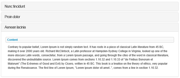
A sample of a page with collapsible content panels displayed in accordion: