Responsiveness
Summary
- improved accessibility of website content on mobile devices and various screen sizes - we can provide visitors with a mobile-friendly user experience
- visible difference in responsive which will fluidly alter its layout while the user resizes the browser window while adaptive design will load a specific layout for the device the user is viewing the site on
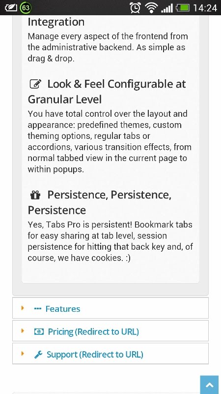
Your DNN tabs can automatically resize themselves to neatly fit on the page, regardless of the size of your screen or device. On mobile devices, it automatically switches to the accordion layout.
We should take into account the difference which is made between Responsive and Adaptive Tabs Pro. While the the page on which Tabs Pro module is enclosed is sent to different device browsers on the client-side, the browser modifies the display of the page in relation to the size of the browser window, while the adaptive Tabs Pro is predominantly server side, meaning that the web server does all the work in detecting various devices and loading the correct style depending on the attributes of the device - the layout is changing depending on the size of the screen, depending on conditions like whether the device has a retina display or not. The server can detect this and display high quality images for retina display devices like iPads and lower quality images for standard-definition displays.
