Items
Title
The Tab’s Title displayed on front-end. Can contain My Tokens.
Show Conditionally
This Boolean expression is used to determine if the tab is visible. Note that this is not the same as hiding it visually. This is evaluated on server side. A common example is [QueryString:Key] == “Value”. Can contain My Tokens. See More examples.
Enable Conditionally
This Boolean expression is used to determine if the tab is enabled. This is evaluated on server side. A common example is [QueryString:Key] == “Value”. Can contain My Tokens. See More examples.
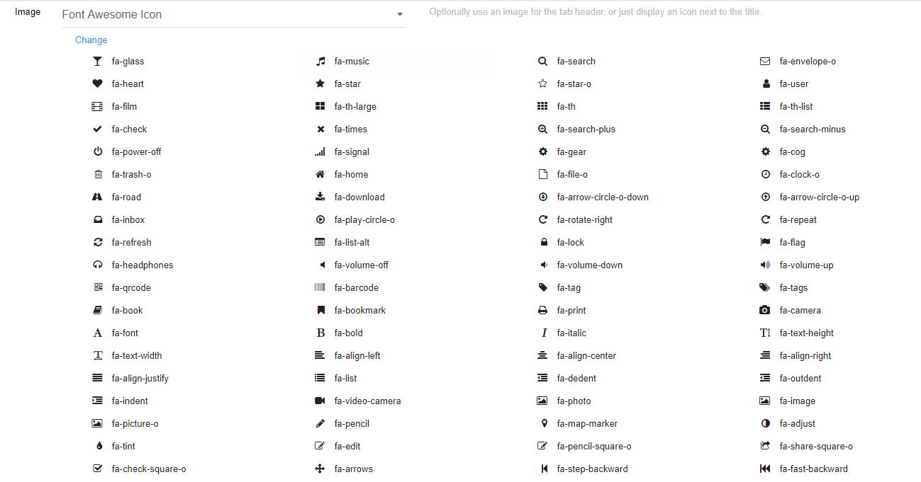
Image
It can be set an image for the tab header, or just display an icon next to the title.
Tabs Pro is using the Font Awesome library version 4.6 and you have the possibility to choose from the list displayed one of the available icons.
All you have to do is to click on “Change” button and select the icon which suits your needs.
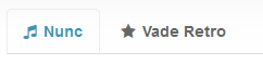
As for the final front end product - here’s a sample of how the icons display inside tabs:
- Icons can be added from current portal or external URLs
- You’ll have to upload images using Admin > File Manager
- Font Awesome 4.1 is also supported
- Use image headers to put your own graphic in tab headers. Note that in today’s web design this technique is not used anymore because they don’t flow nice, are not SEO friendly and don’t play nice with various devices.
- Choose from four available options: Icon (from portal file); Icon (from URL); Font Awesome Icon and Image Header.
Action
A tab has two important behaviors:
Show Modules - shows chosen modules when the tab is currently selected
Redirect to URL - redirects to set URL when the tab is clicked
Use module title
Target the modules by their title. It helps when you want to import/clone the entire page without the need to update the Tabs Pro module bindings. Note: The titles of the modules present on the page need to be unique.
Select Modules
With this function you can select from available modules already existing on the page. Note: In Edit Mode, titles are always visible so you can see which module is which and access module actions.
Display in accordion
This option enables each module to be turned into an Accordion. The module title is used as the panel header.
Stack Direction
Vertical
Horizontal
Default tab
This option enables a default tab for the whole module.
Reevaluate Conditions
When you leave the tab the Show Condition and Enable Condition are reevaluated.