Tabs Layout Options on Bootstrap
Below, you’ll find some captures with the tabs displayed on different locations using all 5 different options, with Bootstrap provider.
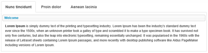
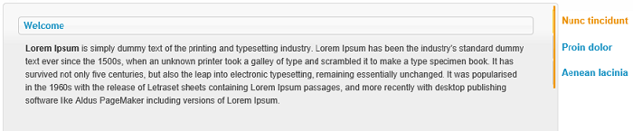
- Tabs at top - the tabs can be placed horizontally above their content by a simple selection of the option “Horizontal Top” from the Tabs Layout drop down list (displayed below):
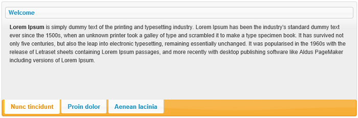
- Tabs at bottom - the option “Horizontal Bottom” from the Tabs Layout drop down list, places the tabs below their module content:
-
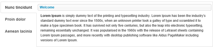
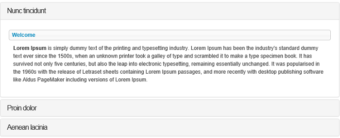
Vertical Left Tabs - either on the left or on the right side of the page, the tabs will be left-aligned and rendered vertically to the left of the module content - by selecting the “Vertical Left” option:
-
Vertical Right Tabs - and vice versa - tabs right-aligned and rendered vertically to the right of the module content - with the “Vertical Right” option:
-
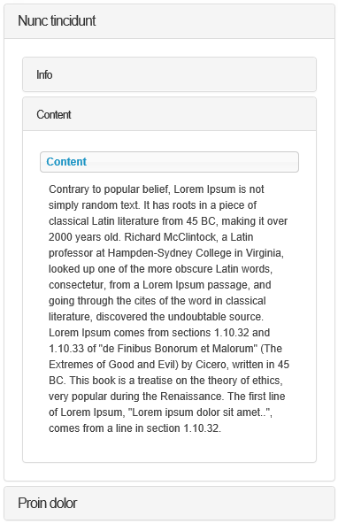
Accordion - this option displays the content panel for presenting the information is a limited amount of space. By default, accordion always keep one tab section opened and you have to click on the other tabs in order to enlarge their content while the previously opened tab will compress the content:
More informations about Accordion Layout setting are below:
Accordion Layout
Summary
- Bootstrap template support the Accordion display
- Inside tabs or accordions, modules can be setup to also display as accordion
- On mobile devices, tabs can be configured to display as accordions
- Accordions are also responsive
- For mobile detection, Tabs Pro uses Asp.NET capabilities (Request.Browser.IsMobileDevice) and a RegeEx based engine against the browser user agent string. 3rd party providers can improve detection accuracy.
Accordion Display
Tabs Pro allows Administrators to include multiple modules in the same tab. Because of this, some tabs can get quite big while others will remain smaller, making the navigation process more difficult.
Luckily, Tabs Pro provides a solution to this, it integrates with Bootstrap, in order to display each module inside an Accordion section. So when one section expands, the other ones are hidden so that the space could be saved.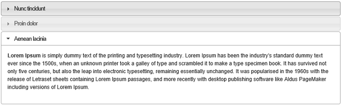
The Accordion display can be combined with all the Tabs layout options so that a tab will be displayed horizontally on top or on bottom, or vertically to the right or to the left and also as accordion - this is what we call nested tabs.
Visually, after you set “Vertical left” as layout and you check the option “Display in accordion” from the Items section, on a tab on which you previously added and selected a couple of modules, the integration for Bootstrap provider will look like in the image below:
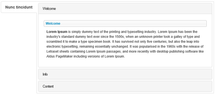
Note that this option is specified per Tab, so you can have one tab displayed as accordion while the other displays normally (the purpose for this could be to make all the tabs look balanced in terms of height).
Accordion on Mobile
On the Settings list, there’s an option for “Use accordion on mobile”, When this option is on, Tabs Pro always renders the items as accordion on mobile devices. Note that this is decided at server and cached in session. For mobile detection, Tabs Pro uses Asp.NET capabilities (Request.Browser.IsMobileDevice) and a RegeEx based engine against the browser user agent string with the purpose of matching and saving all the patterns in the user agent string.